


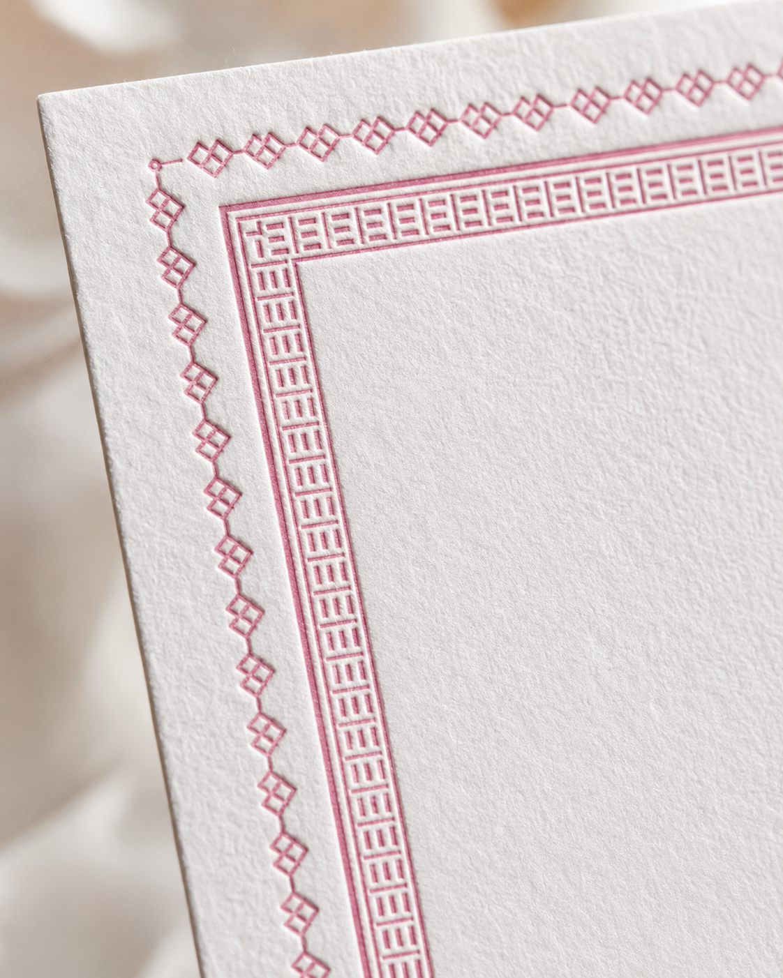
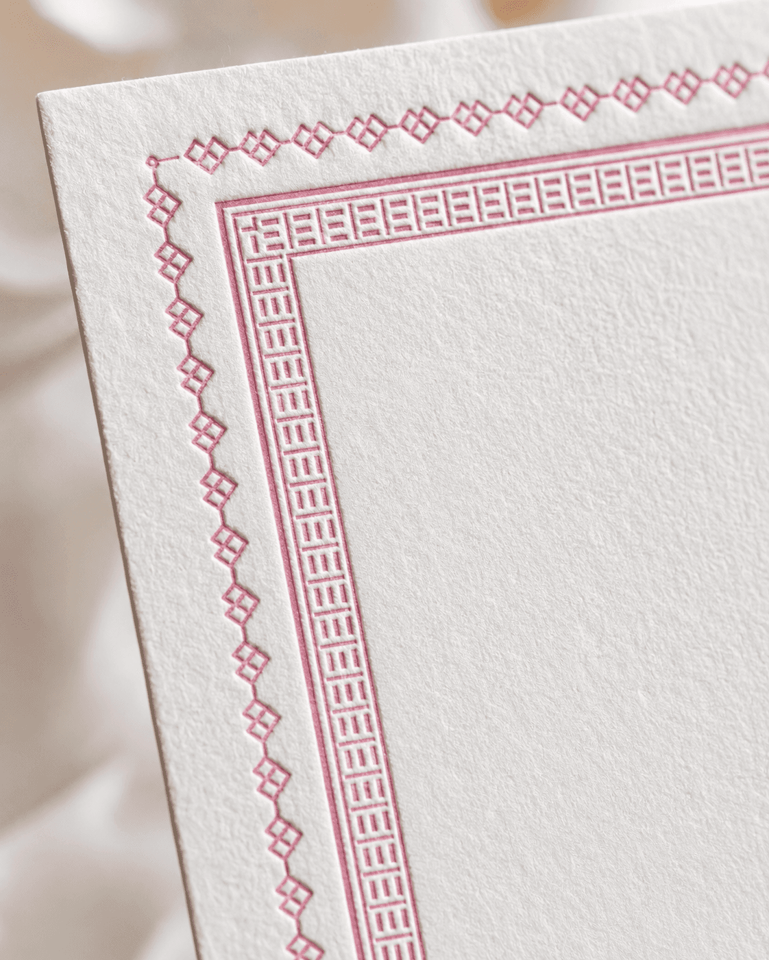
The border carried the system. Two ornamental registers — a geometric outer pattern and a Greek key inner frame — gave the suite its formal structure while leaving room for the typography to breathe.
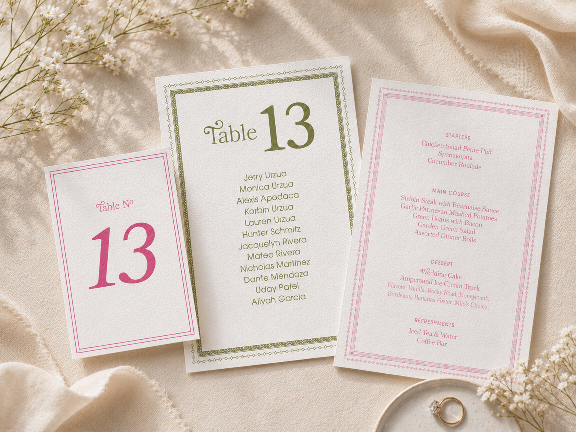
Three ink colors, three formats, one visual language. The olive seating card and pink table number read as a family without being identical — the border carried the system so the colors could differentiate the pieces.
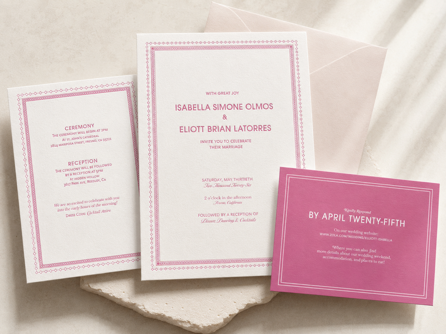
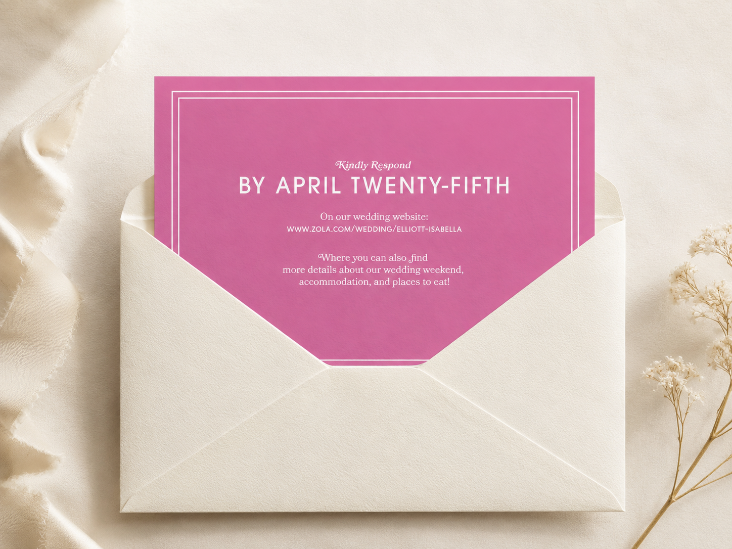
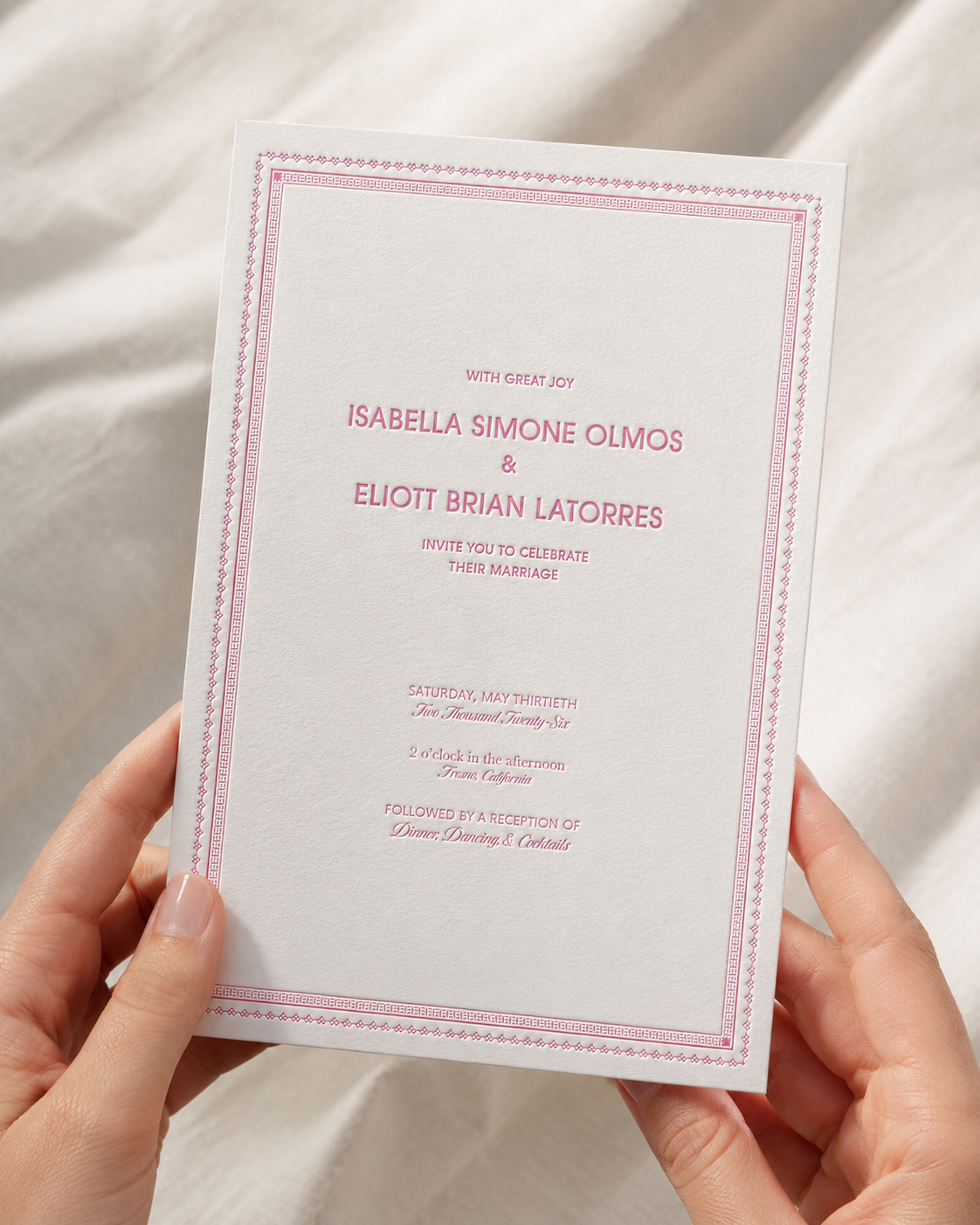
There is a peculiar authority in wedding paper. A few inches of stock can announce family, ceremony, money, taste, and the official beginning of a day that has not yet happened. For Elliott and Isabella, the suite needed to feel formal but not stiff, romantic but not sentimental, ornate but not overrun by ornament. Built from the instruments of print, type, pattern, paper, and ink, it was designed to carry that weight without showing the effort.
The border became the unifying device across the entire suite. Two ornamental registers held together through letterpress production: a geometric outer pattern and a Greek key inner frame, with small private codes embedded in both.
The suite started as an invitation, details card, and RSVP. It ended as a complete wedding print system: 140 dinner menus, 13 table number cards, and 13 seating cards, all built from the same visual language.


The border carried the system. Two ornamental registers — a geometric outer pattern and a Greek key inner frame — gave the suite its formal structure while leaving room for the typography to breathe.


There is a peculiar authority in wedding paper. A few inches of stock can announce family, ceremony, money, taste, and the official beginning of a day that has not yet happened. For Elliott and Isabella, the suite needed to feel formal but not stiff, romantic but not sentimental, ornate but not overrun by ornament. Built from the instruments of print, type, pattern, paper, and ink, it was designed to carry that weight without showing the effort.
The border became the unifying device across the entire suite. Two ornamental registers held together through letterpress production: a geometric outer pattern and a Greek key inner frame, with small private codes embedded in both.
The suite started as an invitation, details card, and RSVP. It ended as a complete wedding print system: 140 dinner menus, 13 table number cards, and 13 seating cards, all built from the same visual language.