


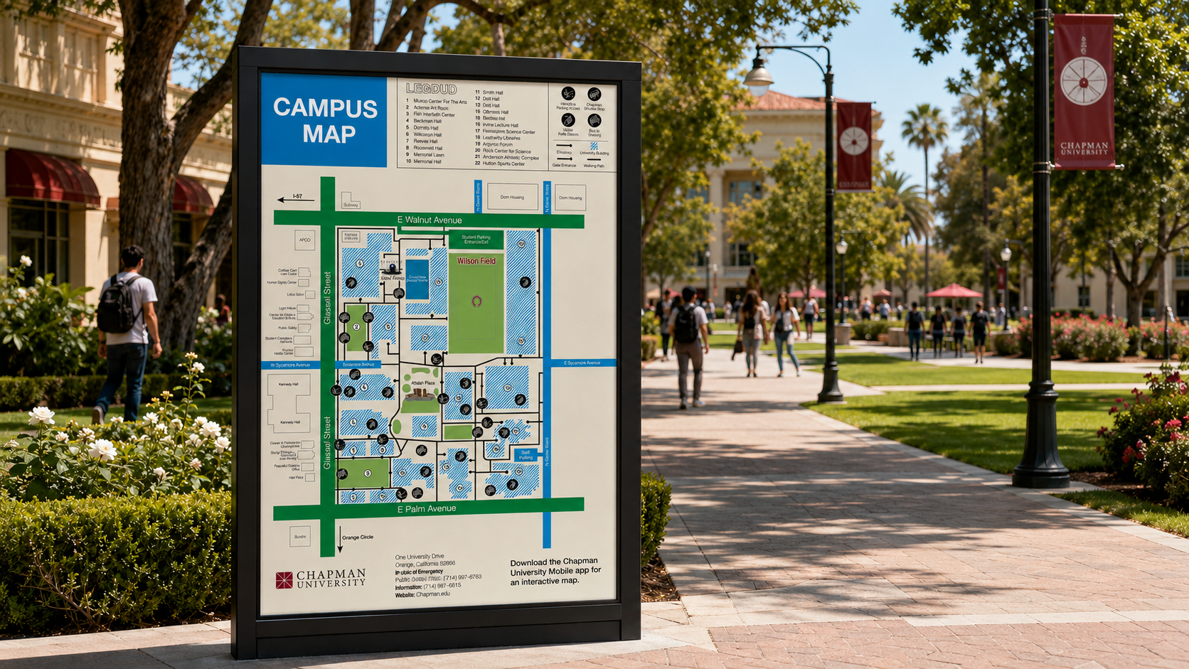
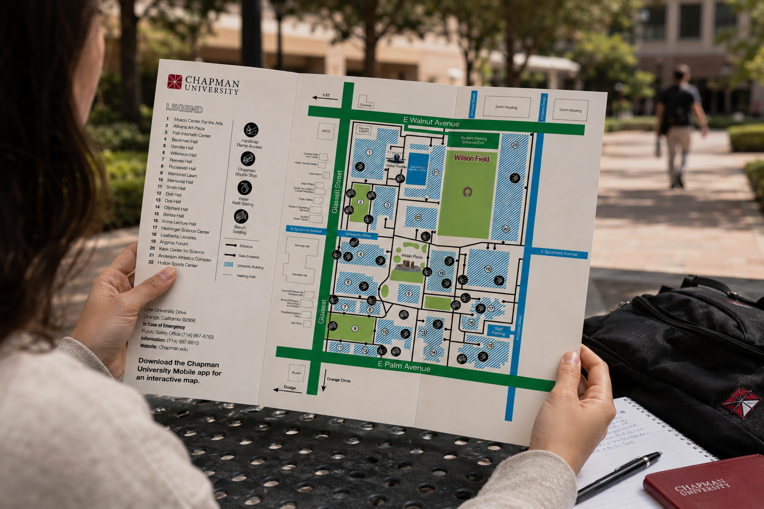
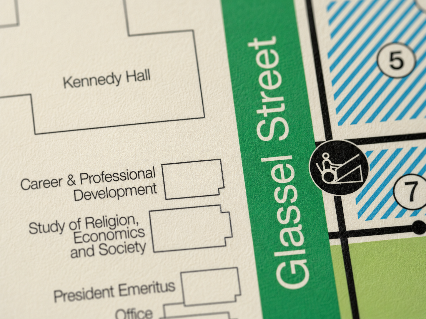
Custom accessibility iconography sits directly on the map rather than relegated to a legend. The decision to place it in context rather than at the margin was intentional. Accessibility information should be found where you need it, not searched for.
A campus is always performing something. At Chapman, the lawns, plazas, arches, and named buildings suggest permanence, arrival, and institutional promise. But a place meant to feel grand still has to be hospitable to the person trying to enter it. A campus map serves people in moments that are rarely neutral: a student imagining a future there, a parent visiting the child who has begun to belong somewhere else, an alumnus returning to a place that has stayed the same only in memory. This redesign focused on Chapman as it is actually experienced by visitors, especially those with mobility needs, making paths, entrances, ramps, benches, and landmarks feel less like infrastructure and more like an invitation.
Most wayfinding is technically compliant and unintentionally exclusive. The visual logic follows the ambulatory user by default, with accessibility information added as an afterthought. This redesign started from the other direction.
The brief was a campus wayfinding system that prioritized mobility access without making accessibility feel like a footnote. That meant rethinking what information goes where, and who the map is actually for.


Custom accessibility iconography sits directly on the map rather than relegated to a legend. The decision to place it in context rather than at the margin was intentional. Accessibility information should be found where you need it, not searched for.
A campus is always performing something. At Chapman, the lawns, plazas, arches, and named buildings suggest permanence, arrival, and institutional promise. But a place meant to feel grand still has to be hospitable to the person trying to enter it. A campus map serves people in moments that are rarely neutral: a student imagining a future there, a parent visiting the child who has begun to belong somewhere else, an alumnus returning to a place that has stayed the same only in memory. This redesign focused on Chapman as it is actually experienced by visitors, especially those with mobility needs, making paths, entrances, ramps, benches, and landmarks feel less like infrastructure and more like an invitation.
Most wayfinding is technically compliant and unintentionally exclusive. The visual logic follows the ambulatory user by default, with accessibility information added as an afterthought. This redesign started from the other direction.
The brief was a campus wayfinding system that prioritized mobility access without making accessibility feel like a footnote. That meant rethinking what information goes where, and who the map is actually for.